Backgrounds & Borders
Backgrounds
Background colour (colour is the only property) can be set for in-line elements e.g. <span>
3 types of background can be set for block elements (<div>, <p>, etc), @page, and for the <body> element:
- background color
- background images (including gradients using CSS3 spec.)
- background gradients (custom style for mPDF - not part of CSS specification - deprecated)
Background Images
mPDF supports most CSS properties to control background-images, including image resolution, opacity and transparency. See Supported CSS.
Background-images support JPG, GIF, PNG, WMF and SVG images.
Background-images are disabled in columns, and when page-break-inside: avoid is used to keep a block together.
NB CSS2.1 states that the area for background-image should include the padding and the BORDER - IE7 does this, but Firefox 3 starts the tiling position 0 inside the border. mPDF complies with CSS and IE7.
Note: Background-color and background-image set on the <body> element will cover the whole page i.e. not inside the “margins”. (cf. Backgrounds & borders)
Gradients defined as background-image
(mPDF ≥ 5.1) Gradients can be defined as background-image: both the Mozilla or the draft CSS3 syntax are supported e.g.:
background: -moz-repeating-linear-gradient(red, blue 20px, red 40px)

background-image: -moz-repeating-linear-gradient(red, blue 20px, red 40px)

background: linear-gradient(top, #c7cdde, #f0f2ff);

background-image: linear-gradient(top, #c7cdde, #f0f2ff);
CSS3/Mozilla gradients in mPDF support: multiple colour-stops, opacity, repeating-gradients, and a number of options for defining the gradient axis (linear gradients) or shape and extent (radial gradients)
For more details see:
- Mozilla linear - https://developer.mozilla.org/en/CSS/-moz-linear-gradient
- Mozilla radial - https://developer.mozilla.org/en/CSS/-moz-radial-gradient
- Mozilla gradients use - https://developer.mozilla.org/en/Using_gradients
- CSS3 linear gradients - http://dev.w3.org/csswg/css3-images/#linear-gradients
- CSS3 radial gradients - http://dev.w3.org/csswg/css3-images/#radial-gradients
Background-gradient (Old form - Deprecated)
Background gradient can be set as a linear or radial gradient between two colours. Background gradients can be set on all block elements e.g. P, DIV, H1-H6, as well as @page and on BODY.
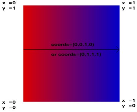
background-gradient: linear #c7cdde #f0f2ff 0 1 0 0.5;
The four numbers are coordinates in the form (x1, y1, x2, y2) which defines the gradient vector. x and y are values from 0 to 1, where 1 represents the height or width of the box as it is printed.
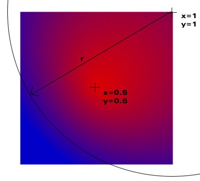
background-gradient: radial #00FFFF #FFFF00 0.5 0.5 0.5 0.5 0.65;
The five numbers are coordinates in the form (x1, y1, x2, y2, r) where (x1, y1) is the starting point of the gradient with color1, (x2, y2) is the center of the circle with color2, and r is the radius of the circle. (x1, y1) should be inside the circle, otherwise some areas will not be defined.
Borders
In addition to the standard CSS styles for borders, border-radius and background-clip are supported. these are defined in the CSS3 draft specification.
Note: Border-radius does not work if Columns are being used,
or if $use_kwt
is true (keep-with-table).
The two length values of the border-*-radius properties define the radii of a quarter ellipse that defines the shape
of the corner of the outer border edge.
The first value is the horizontal radius e.g. in border-top-left-radius: 55pt 25pt 55pt is radius of curve from top
end of left border starting to go round to the top.
If the second length is omitted it is equal to the first (and the corner is thus a quarter circle). If either length is zero, the corner is square, not rounded.
The border-radius shorthand sets all four border-*-radius properties. If values are given before and after the
slash, then the values before the slash set the horizontal radius and the values after the slash set the vertical
radius. If there is no slash, then the values set both radii equally. The four values for each radii are given in
the order top-left, top-right, bottom-right, bottom-left. If bottom-left is omitted it is the same as top-right.
If bottom-right is omitted it is the same as top-left. If top-right is omitted it is the same as top-left.
border-radius: 4em;
would be equivalent to
border-top-left-radius:     4em;
border-top-right-radius:    4em;
border-bottom-right-radius: 4em;
border-bottom-left-radius:  4em;
and
border-radius: 2em 1em 4em / 0.5em 3em;
would be equivalent to
border-top-left-radius:     2em 0.5em;
border-top-right-radius:    1em 3em;
border-bottom-right-radius: 4em 0.5em;
border-bottom-left-radius:  1em 3em;
Border for In-line elements
A border can be also be specified for in-line elements, but with more limited options for the properties. See Supported CSS.
Auto-padding
Note that mPDF does not by default clip/wrap the content of the box to allow for the curved border (which CSS3 states
should). Therefore you need to allow enough padding inside the box. Alternatively you can set the variable
$autoPadding to true
(default: false); this automatically increases the padding in block elements with border-radius set - as required.
Background clipping
background-clip : padding-box | border-box (default: border-box)
defines whether the background is painted to the inside or outside edge of the borders.
Example
div.rounded {
    border:1mm dashed #220044;
    background-color: #f0f2ff;
    border-radius: 3mm / 3mm;
    background-clip: border-box;
    padding: 1em;
}